Artwork Guidelines
May 2016To ensure you get the very best results from your print, we ask all of our clients to review our helpful guide before sending your print ready artwork to us. This will ensure your artwork matches our requirements and you can enjoy hassle free production of your order. Please take the time to read through our helpful guide on preparing print ready files to ensure there are no delays in processing your order.
Let’s start with the perfect artwork…
- PDF or Adobe Illustrator file formats
- Correct card size: 85.6mm x 54mm excl. bleed
- 1.5 mm bleed all around
- 3 mm safe zone (no text near the edges)
- Fonts embedded /outlined /converted to curves
- CMYK colours and not RGB (RGB will result in colour differences)
- Good quality images and graphics (anything above 300dpi is great, Vectors even better)
We can accept all major file formats for artwork with the exception of Corel Draw, Excel, Word and PowerPoint files.
Tips
Tip 1 – CMYK vs RGB

Please ensure all artwork is provided in CMYK format. Files provided in RGB format will be converted into CMYK before print and may result in significant colour differences from what you see on your monitor. Colour matching to a previously printed job MUST be brought to our attention at the ordering stage. A hard copy sample will be required before printing can commence. We cannot be held responsible if your printed work does not match your requirements unless those requirements are brought to our attention prior to print.
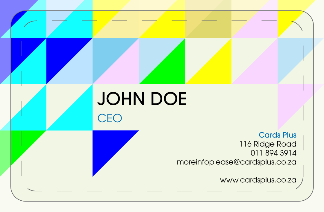
Tip 2 – Safe Zone
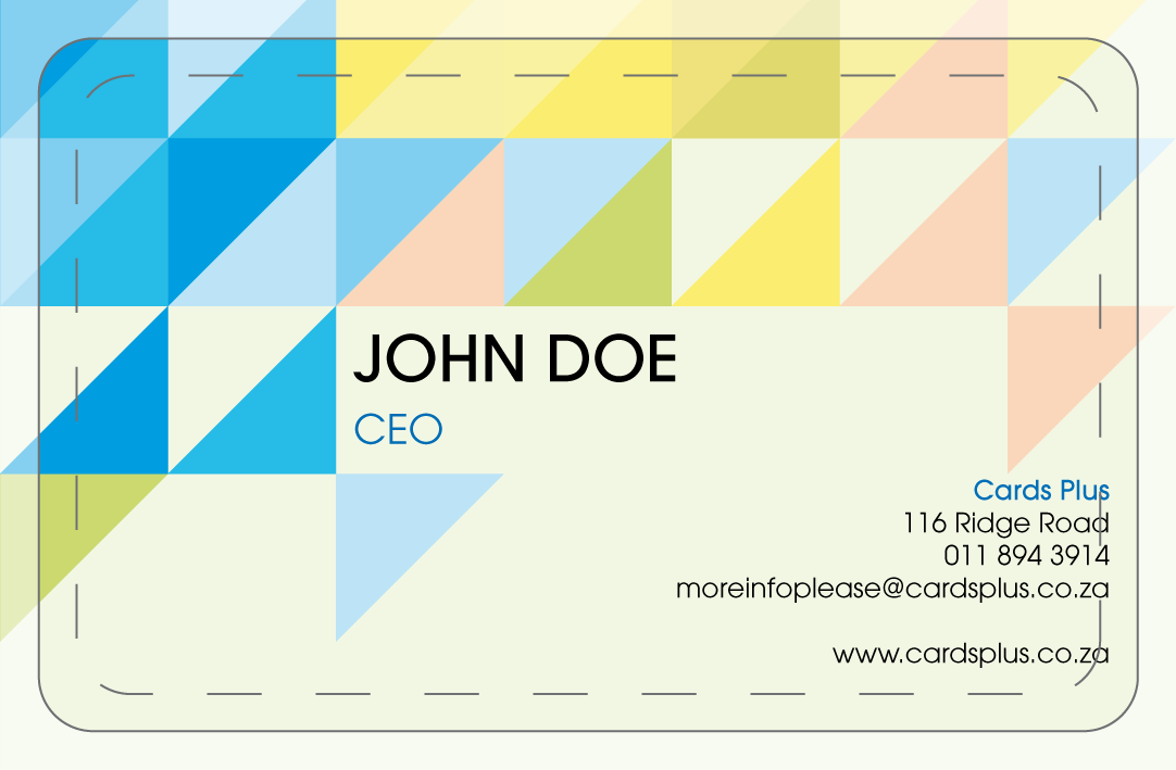

Ensure your artwork has a ‘safe zone‘. Keep text at least 3mm away from the edge of the document, any text outside the safe area may be cut off. Please keep in mind that the corners are round and need an extra 1mm safe zone.
Tip 3 – Fonts

Ensure all fonts are ‘embedded‘. Whilst we have an extensive font collection, there is no guarantee that the version you have used matches ours. If your fonts aren’t embedded our system may substitute the font for a different one. If you struggle to outline/ convert the fonts, you can always send the fonts with your artwork. We will load the fonts to our system and viola!
Tip 4 – High Resolution Images

Ensure all images and graphics are above ‘300dpi‘. If your images look ‘pixelated’ or fuzzy on screen then the chances are it’s not quite good enough quality for professional printing. For best results use vector based graphics.
Tip 5 – No Borders


Sadly the use of borders near edges can result in lopsided cards, and we wouldn’t want that, so avoid them where possible. This includes photos for ID Cards as well. When you’re designing a ID Card, please keep in mind that we cannot include a border around the photo unless the photos are all exactly the same size. If they are not all the same size, the photo might not fit perfectly in the border and the background artwork might show between the edge of the photo and the border line.
Tip 6 – Bleed


Ensure graphics and images go right to the edge of the artwork – past the safe zone, trim line, right up to the bleed line. If your images/graphics don’t, it may result in a strip of the background colour showing through on the edge.
For more tips or to Download our full Artwork Guidelines please click here.